The Hidden Meanings Behind Food Colors: Marketing Tactics Exposed
Navigating the supermarket aisles, you're unknowingly walking through a painter's palette, where every color has been meticulously chosen to speak directly to your subconscious. The hues that grace packaging aren't just random selections; they're part of a carefully orchestrated marketing symphony designed to influence your buying habits.
From the red that quickens your pulse and whets your appetite to the green that whispers promises of health and vitality, each color serves a purpose. But what are the stories these colors are really telling, and how do they affect your decisions at the shelf?
Uncover the secrets behind the spectrum that guides your grocery cart, and you might never look at a product the same way again.
Decoding Red: Appetite Trigger

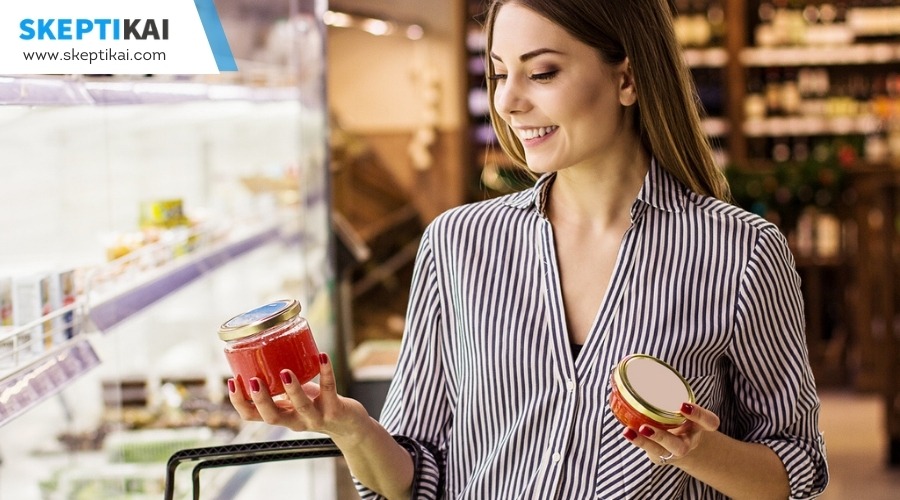
The color red doesn't just catch your eye; it also subtly nudges your appetite into overdrive. When you're wandering down aisles or scrolling through your favorite food delivery app, it's no coincidence that red logos, packaging, and advertisements seem to pop up everywhere. This isn't just a happy accident; it's a calculated move by marketers. They're leveraging the power of color psychology, specifically the color red, to make you feel hungrier.
Research backs up this strategy, showing that red can't only increase your heart rate but also create a sense of urgency. This urgency isn't just about making you feel like you need to make a decision quickly; it's about making you crave food more intensely. The food industry has taken note, using red in everything from logos to the decor in restaurants, ensuring that your appetite is piqued the moment you lay eyes on their brand.
Red's association with passion and excitement is another tool in the food marketer's arsenal. By incorporating red into their branding, they're not just saying, 'Look at me!' They're saying, 'You want this. You're excited about this.' And more often than not, you're – even if you didn't know you were hungry to begin with.
Yellow's Cheerful Persuasion
Brightening up food aisles, yellow's cheerful hue not only catches your eye but also lifts your spirits, making you more inclined to reach for products wrapped in its sunny embrace. This isn't by chance; it's a calculated move by brands to leverage the power of colors, specifically packaging colors, to influence your buying decisions. When you see yellow on food packaging, it's tapping into Color Psychology to evoke feelings of happiness, optimism, and warmth, subtly persuading you that you're not just buying a product, but also a slice of joy.
Consider how yellow is used in the food industry to create a specific atmosphere around products:
- Cereal boxes bursting with yellow suggest a bright start to your day.
- Snack bags with bold yellow hues promise fun and energy.
- Lemon-flavored drinks use yellow to hint at their refreshing taste.
- Discount stickers often come in yellow, catching your eye and suggesting savings.
Yellow's role in food packaging goes beyond mere aesthetics; it's a strategic tool for brands to convey cheerfulness, affordability, and innovation. It triggers impulse buying by suggesting freshness and energy, making you feel more comfortable and optimistic about your purchase.
Green for Health and Nature
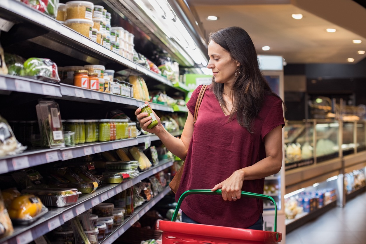
While yellow brings a slice of joy to your shopping experience, green signals a journey towards health and nature on the shelves. Brands cleverly use green packaging to whisper promises of a healthier, more natural lifestyle, directly tapping into your subconscious desire for well-being and environmental harmony. When you see green, it's not just a color; it's an emblem of vitality, a nod to sustainability, and an assurance of natural ingredients.
| Aspect | What Green Signifies | Consumer Perception |
|---|---|---|
| Packaging | Organic, Healthy | Trust, Authenticity |
| Branding | Nature, Freshness | Well-being, Sustainability |
| Product Design | Vitality, Environment | Natural Ingredients, Eco-friendly |
| Advertising | Health, Freshness | Desire for a Healthy Lifestyle |
| Store Layout | Nature, Authenticity | Journey towards Health |
This strategic use of green doesn't just decorate the shelves; it creates a narrative. A narrative where health, nature, and freshness are paramount, making you feel like choosing green-labeled products is not just a purchase but a step towards a healthier lifestyle and a better world.
Blue's Trust and Calm Appeal
Stepping into the realm of blue, you'll find it embodies trust and serenity, making it a powerful tool in food packaging to communicate reliability. This color, often associated with the sky and the sea, brings a sense of calm and purity to the table, literally. It's no wonder that brands leverage blue to signify professionalism and integrity in their products.
Here's how blue makes its mark in the food industry:
- Trust: Blue's association with dependability encourages you to believe in the product's quality and safety.
- Calm: The soothing effect of blue can make the act of choosing a product less overwhelming, offering a tranquil shopping experience.
- Professionalism: Brands use blue to project an image of professionalism, aiming to win your confidence through their packaging.
- Purity: The rarity of blue in natural foods makes it a symbol of cleanliness, suggesting that the product is pure and untainted.
Through these attributes, blue captures your attention on the shelf, promising a reliable, serene, and professional choice. Its unique appeal in the food industry is undeniable, making it a strategic color for brands aiming to stand out and connect with their audience.
The Luxury of Purple
After exploring the serene appeal of blue, let's shift focus to the regal presence of purple in the food industry, a color that embodies luxury and sophistication. You'll notice that high-end food products often lean towards purple in their branding. This isn't by accident. Purple's association with luxury makes it a magnet for those seeking sophistication in their purchases. Consider the allure of acai berries and purple sweet potatoes, foods that not only tantalize the taste buds but also carry an air of exclusivity due to their exotic nature.
The elegance and creativity conveyed through purple packaging can significantly enhance a product's perceived value. It's a subtle nudge that tells you you're not just buying a food item; you're indulging in an experience. This strategy is particularly effective in appealing to upscale consumers who are always on the lookout for something unique and luxurious.
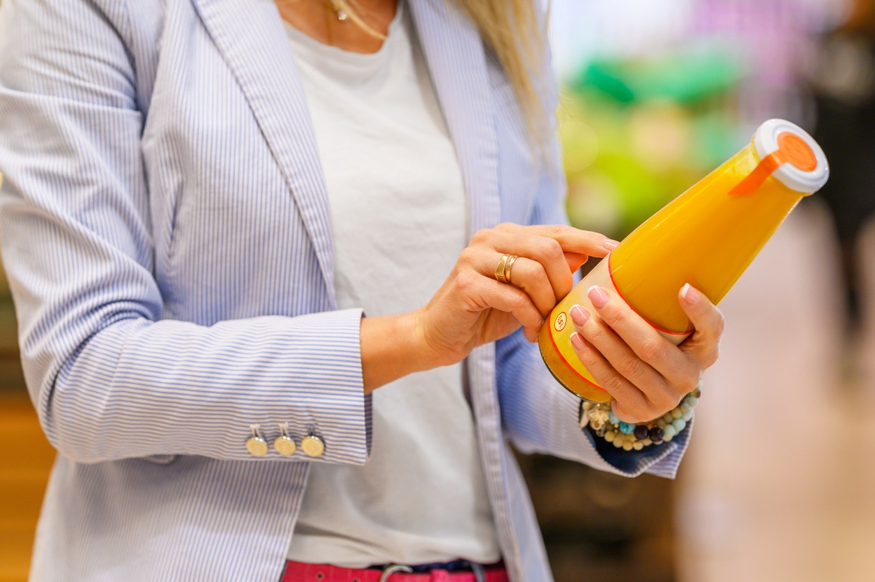
Orange's Energetic Call to Action

Diving into the vibrant world of orange, you'll find it's not just a color but an energetic call to action that invigorates the food industry with its lively appeal. When you see orange, you're not just looking at a hue; you're being invited into a world of energy, enthusiasm, and an irresistible urge to engage. This color doesn't whisper; it shouts, urging you to move, to feel the excitement, and to act now.
Consider how orange makes its mark:
- In snack packaging, where its warmth beckons you closer, promising a burst of flavor and fun.
- On fast-food logos, where it sparks your appetite, nudging you towards a quick, satisfying meal.
- Through limited-time offers, where the urgency of orange screams, 'Don't miss out!'
- With innovative food products, where it stands for creativity and adventure, daring you to try something new.
Orange's magic lies in its ability to combine excitement with a warm welcome, making it a powerhouse in the food industry. It's not just about seeing a color; it's about feeling a call to action. Orange doesn't just catch your eye—it captures your appetite and imagination, pushing you towards the next delicious adventure.
The Clean Slate of White
Exploring the color white in the food industry reveals its power to communicate cleanliness, purity, and a fresh beginning with every glance. When you see white packaging on the shelves, it's not just a design choice. It's a strategic move to associate products with freshness and hygiene. This is especially true for health-oriented foods, where white signals a product that's good for you, straightforward, and stripped of unnecessary additives.
White's simplicity also lends an air of sophistication to products. It suggests that what's inside is of high quality and doesn't need flashy colors to stand out. This minimalist approach can make a product appear more modern, appealing to consumers looking for the latest in health and wellness trends.
Moreover, when used in food photography, a white background can make the colors of the product pop, making it look more vibrant and appetizing. It's a clever tactic to draw your eye and emphasize the freshness and purity of the food.
Black's Sophistication and Mystery

Venturing into the realm of black packaging, you'll find it exudes an aura of sophistication, luxury, and mystery, setting high-end products apart from the crowd. When you're browsing the aisles for something special, black packaging whispers tales of exclusivity and top-tier quality, making you feel like you're not just buying a product, but indulging in an experience.
In the world of food packaging, black serves as a canvas that accentuates the allure of premium products. Its boldness offers a stark contrast to the vibrant colors typically associated with consumer goods, drawing your attention and suggesting a promise of unparalleled quality. Here's how black packaging crafts an image of luxury and mystery:
- It envelops gourmet chocolates, making each piece seem like a precious gem waiting to be discovered.
- The sleek design of black coffee bags hints at the rich, complex flavors contained within.
- Black labels on high-end wine bottles convey a sense of tradition and craftsmanship.
- Artisanal cheeses wrapped in black suggest a depth of flavor and heritage that stand out in a sea of options.
Conclusion
You've now uncovered the secret world where colors do more than just please the eye; they're wielded by brands to sway your choices and feelings about food. From red stirring your appetite, green signaling health, to black adding an air of mystery, each hue has its role.
It's not just about taste; it's a visual and emotional play. Being aware lets you see beyond the color, making conscious decisions about what you eat based on more than just the packaging's appeal.